
A lot of stands look great from the aisle. Big graphics, lots of light, impressive structure. People slow down, take a quick look, then drift straight past. The difference between a stand that shows well and a stand people actually want to walk into usually comes down to design thinking, not budget or gimmicks.
Here is how to create a stand that does more than look good. One that feels right, draws people in and invites proper conversations.
Make the entrance feel easy. Your threshold matters
Every stand has an invisible line between the hall and your space. If that area feels blocked, cluttered or awkward, people will not step over it.
Keep the front open. Avoid a straight counter right across the entrance. Pull furniture back a little so the space feels like it is welcoming people in rather than keeping them out. If you want something near the front, angle it slightly so it feels more like an invitation. A hero product placed with a bit of thought can also do a lot of work in getting people to step inside.
Design the flow around how people naturally move
Think of your stand like a small shop or gallery. People should be able to walk in and move through it without any effort.
Give them a clear entry, some breathing space in the centre, and a simple path that guides them past the key areas. Avoid narrow pinch points or walls that feel like dead ends. If you find yourself wanting to draw arrows on a plan to explain the flow, it might be worth simplifying it.
Use split flooring to guide movement without signs
One trick that works incredibly well is changing the flooring to guide people. The same idea you see in airports. Hard flooring naturally encourages movement, while carpet encourages people to slow down and stop.
Use this to your advantage. Hard flooring at the entrance and through the main circulation makes people feel confident stepping in and moving around. Softer carpeted areas create natural zones for chats, demos or product moments. It works subtly, but it makes the whole stand feel more intentional and helps guide behaviour without a single sign or instruction.
Use sightlines that pull people inward
Whether someone stops often depends on what they can see as they approach. Clear sightlines help a lot.
Make sure the interesting parts of your stand face the busier aisles. Avoid tall items blocking the middle. Keep your key messages at eye height, and make sure your main feature can be seen from a few different angles. Good sightlines do more for engagement than most people realise.
Give your hero area room to breathe
Every stand benefits from a focal point. It could be your main product, a display or a simple demo.
Whatever it is, it needs space. Light it well, keep it clean and avoid surrounding it with too many competing elements. One strong focal point usually works better than several weaker ones crowded together.
Keep the whole space comfortable rather than crowded
If your stand feels cramped, most people will avoid stepping in. A calm, comfortable layout helps people relax and spend time with you.
This does not mean adding sofas. It means choosing consistent furniture, hiding coats and bags, and giving people a place to stand without feeling in the way. Clean and uncluttered always feels more premium and more inviting.
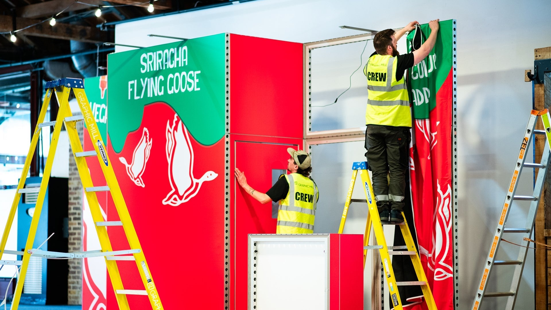
Use graphics to guide people rather than overwhelm them
If someone has to stand still and decode a wall of text, they probably will not. Graphics should make things clearer, not harder.
Keep each wall to one main message. Use clean type, strong imagery and plenty of space around the content. Let your graphics support the layout rather than shout over it.
In short
A stand people want to walk into does not need to be loud or expensive. It just needs to feel intentional. A clear entrance, natural flow, smart use of flooring, visible focal point, tidy layout and calm graphics all work together to create a space that feels inviting.
Get those right and the stand starts doing the work for


Share: